u/Z3R0gravitas

Hydrogel screen protector reveals sub-pixels and temporal dithering of TCL NXTpaper 60 Ultra screen
▲ 25 r/ScreenSensitive+1 crossposts

Hydrogel screen protector reveals sub-pixels and temporal dithering of TCL NXTpaper 60 Ultra screen

I bought a cheap (£5) "Anti-Blue Light Hydrogel Screen Protector" via eBay, not expecting anything. Surprisingly, the screen does possibly feel a little more comfortable than it did without it (although my tolerance may have shifted). It makes it massively more reflective, of course...

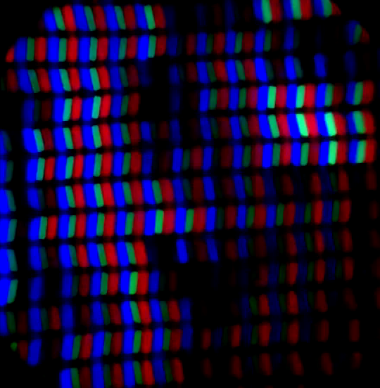
But the bigger surprise: it made the sub-pixel structure crystal clear! Compared to without, shown in my review... This indicates the "nano etched" matte surface finish is the only thing obstructing the view. I had the impression there should be more going on under the surface, but the information about a "Middle Layer: Diffuse Reflection" in the version 3 screen whitepaper is omitted in version 4's. And this is my first TCL product, so I've no feel for any changes in appearance.

Microscope video at 480fps (16x slowdown) of the middle of the test image on the \"Colour mode & temperature\" settings screen (indicated in image below).

The upshot is that we can clearly spot any temporal dithering going on (YouTube version of above as a backup)... But I actually struggled to find any TD in the usual places: home screen icon text, gradients, including Lagom test page (in image below), or NXTpaper modes (surprisingly)... But it is definitely there in HDR YouTube videos (eg "COSTA RICA IN 4K 60fps HDR") and performing an absolute disco on the settings page test image (below):

TCL NXTpaper 60 Ultra. Left: settings page with dithering image and flash reflection demonstration. Right: Lagom test page and Carson Microflip scope (that was attached to my old OnePlus 8T).

A problem is that I have previously used ADB commands to try to disable HDR capabilities (and so TD). I think I re-enabled this (back to default) upon retesting, previously. But I couldn't be sure then (or now) if I've changed something that will reduce TD. And don't have the time to fiddle with it a 3rd time. u/NSutrich has done similar and reported similar observations. But I'd appreciate anyone else, with a 'clean' new phone, confirming what they see, too. Using a suitable screen protector - hydrogel may be more clearly visible than glass, conforming to the surface texture better.

Example of the lack of obvious dithering (below and on YouTube). There are possibly slight fluctuations of the half-dimmed green sub-pixels, on the long edge of the "r". Which I wouldn't know enough to distinguish between TD, text anti-aliasing or pixel inversion..? There are, however, little black splotch flashes, kind of like film grain. I wondered if they are camera sensor noise..? But I've not noticed them elsewhere. So maybe some phenomenon with the backlight? They don't appear to align well with sub-pixels, although they are more visible on red ones, at the ends (some inversion artifact?).

Example of a lack of clear TD on lettering. But clear black flashes all over.

Bonus screen protector filtering evaluation: I had a go at making a precise measurement of the colour spectrum of the screen, before and after, using my cheap spectroscope. By locking my camera to the exact same Pro mode settings and measuring the same part of the screen, etc, I measured a possible blue colour intensity reduction of about 5% (relative to the red and green intensity changes). But I guestimate the potential error in my measurement to be as big as this value. So not significant. And directly overlaying (and subtracting) the 'before' and 'with protector' spectrum photos showed total black, so no notable difference between them.

Top: screenshot of phone taking the spectrum photo. Bottom: Affinity photo comparison.

Hence I'd say the blue light blocking of the screen is wishful thinking, at best (perhaps block some UV, who knows). So any change in comfort is more likely from the crisper screen appearance. It feels nicer to my finger tips. Looks better used indoors, in dim lighting. But it hopeless outside; the worse of both worlds, being reflective and less bright than contemporary OLEDs.

tl;dr: cheap blue-light screen filter doesn't work as intended, but may help those who suffered from the blurriness of this screen finish. But reflections are far worse. Handy trick for testing other devices with a matte finish obscuring the pixel structure. TCL 60 Ultra shows minimal temporal dithering in most everyday contexts.

Edit 2026-05-10: fixed images broken by delayed Reddit bug. Minor text tweaks.

(Thumbnail image hack)

reddit.com
u/Z3R0gravitas — 5 days ago

tl;dr (contents):

  1. Device explained (illustration).
  2. KSF phosphor - my LCD device readings & hypothesis for it causing some issues.
  3. Blue light peak wavelength location, measurement accuracy, my other LCDs and OLED phones.
  4. Melanopsin gap, eye physiology deep dive (excess pupil dilation, modulated flicker sensitivity, etc).
  5. Light bulbs - Incandescent, LED, Fluorescent (all have better spectra).
  6. My personal experiences.
  7. Tips for taking readings.
  8. Credits.
  9. Summary of suggestions.

(Questions and feedback are welcome after a partial reading or only looking at the pictures.)

Fig.1: Illustration of use: device on, or held up to, a screen (left). View through the lens (right).

(1)  I propose..:

This Eisco Spectroscope as a cheap tool to add to our testing arsenal. Along with established Opple, Carson Microflip + slow-motion phone cams, and maybe a polarising filter next? I just bought the Eisco in the UK (from Rapid, via eBay) for £9 delivered.

This device is entirely passive, relying on your eye or phone cam to peek into the lens. Arguably a little less fiddly than a clip-on microscope, in my experience. It only shows off the most obvious colour spectrum features, with more of a vibe check for the absolute amplitude of light. But it is about 1/50th (or less) the cost of a professional spectrometer, which only a few here have access to.

Bonus STEM fun for kids, or anyone, to see emission/absorption lines in the colour spectrum of light, split by the cheap diffraction grating inside (500 lines per millimetre). Projected alongside a backlit wavelength scale (400-700nm). Eg fluorescent tubes have the most striking and varied emission lines (examples later on).

(2)  KSF phosphor confirmation may be the killer app, for us(?):

Fig.2: Annotated composite of readings from 3 of my LCD devices, below an illustrative reading from a high quality spectrometer (of a laptop) showing there are, in fact, 5 total peaks, at high spectral resolution.

KSF Phosphor is used in almost all contemporary LCD backlights. It gives more vivid reds, for less power consumption than nitride phosphors (that are still included in lesser amounts). KSF achieves this via very sharp spectrum spikes, which stimulate human retina L-cones (long wavelength = red) more strongly

Perhaps too strongly, causing some of us direct over-stimulation (or retinal neurons). Our bright light eyelid closing reflex is more red dependant, too, I believe.

Or, the lower overall red light flux fails to balance deleterious biological effects of the blue peak photons (eg inhibits mitochondria). See this diagram of KSF’s smaller area under curve, vs traditional nitride red phosphor. Taken from this “Introduction to KSF Phosphor LEDs[…]”.

Or, some point to the slower decay of KSF's light emissions, potentially causing visual processing stresses, in conjunction with flickering of screens (eg black frame insertion). Although I don’t quite understand how this would work with non-emissive pixels… 

What else?

I was wondering if KSF could be the reason I can't stand the blueness of my TCL NXTpaper 60 Ultra (my review)... But my ThinkPad, which I tolerate OK, also shows KSF lines very clearly (above); the split in the larger spike can even be seen..! And my 11" Lenovo tablet, I used heavily a year ago (also above)... So I suspect KSF may only be a contributing factor that (for some) can be compensated for with: lower brightness, better software colour filters (F.Lux on windows) and maybe hardware level blue filtering layers (which reduce energy efficiency)..?

3)  Peak positions (and measurement precision): 

I'm told the exact wavelength of the blue peak can also have a big impact on screen tolerance. Shorter wavelengths of electromagnetic radiation are intrinsically more damaging (higher energy photons, closer to UV)... 

A healthy macula (inside the eye) may filter ~90% of blue light from reaching the retina, using carotenoid nutrients: lutein and zeaxanthin. Shielding it from excess oxidative stress, etc. According to Wikipedia, blue light hazard is implicated in eye stain, but evidence is contested, with blue blocking glasses not necessarily helping (a bit on this later).

I’m not sure what might be interpreted from the green peak position. Shorter wavelength (left shift) may stimulate rods a little more strongly? Cones less?

Fig.3: More of my devices. QD (quantum dot) backlight has a longer wavelength red (maybe more gentle) and shorter wavelength green (unknown effect). Note: vertical divisions in the green bar are sub-pixels spread across the width of the spectroscope’s slit, forming a 1D image. Older WLED LCD backlights have gentler spectrum curves, but fainter red zones; the Dell needs permanent F.Lux dimming for my comfort. 

This scope can definitely give a good relative comparison between devices, for emitters with narrow spreads. But I’m not sure it is precise enough to make confident absolute measurements of eg 430 vs 450nm; the wavelengths on my unit appear slightly offset. Possible per-unit calibration issue?

I did, however, slightly improve the spectral resolution by narrowing the slit using black tape stuck partly over it (width-wise). The trade-off being a dimmer display of colours. Using pro mode on a phone cam is also important to preserve the details, avoiding the colour bands over-exposing (when the surroundings are the dark black interior).

Fig.4: My Comfy old OnePlus 8T vs a new Nord 5 that looks a bit too yellow-green when dimmed (vs pinky-red). All devices at full brightness, eye-care disabled, etc, for these tests.

I couldn’t assess the absolute amplitudes of each colour peak, from this. Or even a firm relative indication… In principle, one could use the same phone camera, in the same pro-mode settings, with the exposure dialed down far enough. Then check the colour values in a paint program/tool. 

(Blue sky thinking: maybe this process could be digitised, using a custom-made app? (Any bored vibe-coders in chat? Of course the camera’s (specific) colour response curves will filter what can be measured.

4)  Melanopsin gap hypothesis with vision deep dive:

A big feature of all the screens I’ve shown here is the *absence* of light between blue and green. A dark strip in the spectrum. It is more energy (and material) efficient for devices to only emit ‘photopic’ wavelengths - the light we consciously perceive via the rods and cones in our retinas. But this omission has consequences…

Melanopsin is a light sensitive pigment that reacts to detect photons, very similar to the opsins in cones/rods (but discovered later). It’s located inside intrinsically photosensitive retinal ganglion cells (ipRGCs) - neurons in the retina that process signals from rods and cones directly beneath them (they are mostly transparent). Melanopsin is most sensitive in this illumination dip, at around 480-490nm (precise sensitivity still seems debated).

Fig.5: Annotated composite image of Wikipedia illustrations.

Stimulating melanopsin is most well known to delay circadian rhythm at night (and entrain it in the morning) by suppressing melatonin production. (It also stimulates dopamine release.) We’ve all heard how “blue light” is bad at bed time. While there is some stimulation by pure blue, cyan (half way to green) is most potent. Wearable devices (like eg Re-timer) emit only this range of light, for its health benefits (circadian and alertness). 

Fig.6: (Top) Screenshot from blog, link and details below. (Bottom) screenshot of sunlight spectrum in their visualiser tool. Note the extra UV (which may guard against myopia) and infrared, as well as cyan.

This old F.Lux blog piece (screenshot above) lamented the advent of the OLED iPhone X, for an *increased* amount of light encroaching on the “melanoptic” region of the spectrum. (Sunlight comparison from their old “Fluxometer” visualiser tool, discussed here.) So, while my post is researched in its details, what I suggest below is somewhat of a hot-take interpretation; it runs somewhat counter to these mainstream concerns (too much ‘blue’) and I’ve not seen this talked about in our community, either...

Melanopsin’s other effects:

(a) Pupil constriction (up to 16x) over which melanopsin has the strongest effect. Sustaining contraction in bright light, after a few seconds to respond. This follows immediate (eg bright flash) responses mediated by cones. And precedes the ‘bleaching’ effect on rod/cone opsin photopigments, which can take minutes to fully transition. This last mechanism is what leaves a *negative* colour after-image from staring at strong colours. (Positive after-images, palinopsia, probably relates more to neuron hyper-excitability.)

Hypothesis: under-stimulating melanopsin will surely contribute to our eyes letting in more photoptic (consciously visible) light from screens, compared with naturally lit scenes. Increasing visual stress by heightening the strength of signals sent down the optic nerve. Presumably contributing to a sense of glare or excess colour saturation. Merely give a wow factor to unaffected people. But taxing the energy intensive cellular processes of the retina itself...

Compounding effects: the sympathetic nervous system (SNS) also dilates pupils more. It is commonly over-active in our screen sensitive demographics: neurodivergent and/or chronically ill (eg ME/CFS). More dilated pupils also makes focusing harder (narrower depth of field), taxing the eye’s ciliary muscles and exacerbating astigmatism or difficulties with close-work… Dark mode may cause further dilation.

Speculations: blue blocking glasses (or FL-41) may not help this issue, because reducing the blue (and green) screen light would also reduce their stimulation of melanopsin. They could cause further dilation, sensitising to red more… Some people may have genetic mutations, inhibiting the sensitivity of melanopsin. Or acquired damage to the signalling pathway that runs up the optic nerve to midbrain and back… 

Conversely: melanopsin-containing ipRGCs have a direct neural pathway to the thalamus, allowing them to signal severe photophobic pain during migraines or brain inflammation See Noseda et al., 2010. So, while supplementing this wavelength would be an interesting screen tolerance experiment, I’m expecting it could instead cause more problems for some, or many, here. However, in a follow-up 2016 paper demonstrated that rods and cones also mediate this pain, with isolated blue, red, and amber all problematic, but not green.

(b) Modulating retinal image processing - the retina encodes different aspects of light stimuli into separate streams of information, sent along the optic nerve. Which is made of the long axons of the various retinal ganglion cells, of which ipRGCs are just one type (accounting for 1-2% of total). They modulate other RGCs via amacrine cells, that release dopamine (see c, below). The main information pathways and their RGC classes:

  • Parvocellular (P-Pathway), Midget Cells (narrow field), ~80% of total - fine spatial detail, colour, (red-green), slow (low-frequency).
  • Magnocellular (M-Pathway), parasol cells (large receptive field), ~10% - motion, luminance, contrast, high speed.
  • Koniocellular (K), Small Bistratified Cells, ~10% - blue (vs yellow) colour processing.
  • Direction-Selective Cells (depending how one divides things) and others…

There’s overwhelming functional detail here that I’ve not managed to research and remember. But some rough indications of effects are..:

Contrast sensitivity - is increased by melanoptic ipRGCs stimulation (2023 paper). So relatively less stimulation should decrease visual acuity and spatial resolution, making it harder to read small text, etc. More eye strain if already struggling… Note that reduced contrast sensitivity is taken as a sign of CIRS (mold toxicity) by Dr Richie Shoemaker and followers. I think this is caused by inflammation of the optic nerve and such?

Colour sensitivity - altered, shift in perceived “unique white” (colour balance). Ability to discriminate colours may be reduced with less melanotic light, especially on the blue-yellow axis..? A lack of NIR light may also inhibit colour discrimination, via decreased mitochondrial function (2026 Glen Jeffery paper).

Temporal (Flicker) sensitivity - malanopsin itself is too sluggish to respond to flicker directly (2016 paper). But modulates the frequency receptivity of other retinal neurons. Findings seem varied and possibly species dependent. A mouse study (2016 paper) showed reduced melanopsin function tuned vision to lower frequency stimuli, 0.2Hz vs 1Hz (I don’t understand the meaning of such low rates)...

While decreased melanopsin resulted in increased (but more variable) flash ERG response gain (2014 paper). ERG being the “Cone Flash Electroretinogram”, which specifically checks cone cell function by using higher frequency stimulation, eg 30Hz, while rods only go up to ~15Hz (2015 paper). So both lower frequency discrimination and an increased sensitivity to flicker/flashes, with less cyan light..? Complex.

I think it would be very helpful for us to map out and understand the differing frequency (and other stimuli) responses of the various cell types, pathways and brain regions. It’s convoluted and contradictory to comprehend though; both me (and I think) Gemini Pro have inverted meanings a few times, going over aspects of the above repeatedly. And we’ve not gone past the relatively well defined retina to cortical processing, the likely location of most of our visual stress.

(c) Slight tangents (vague speculations): melanopsin's effects, in the retina, are signalled by localised dopamine release. So I’m wondering about tie-ins with ME/CFS, autism, etc, possibly having reduced dopamine levels  with hypothesised metabolic issues synthesising and degrading this neurotransmitter… Similarly, these conditions may be associated with slowed glutamate recycling/conversion - excess sat around leading to a degree of CNS (brain) hyper-excitability. Tying in with migraines, seizure-like effects, visual snow, etc… 

Oddly, cones signal darkness with continual glutamate release. The signal is then inverted. I’m not sure how this idiosyncrasy would be differently affected by such pathology. But Latanoprost (eye drops to lower intraocular pressure), which some had success with, also counteracts excess glutamate… Finally, the opsins use active vitamin-A (11-cis-retinal, to make the light sensitive rhodopsin pigments) and our vit-A metabolism may often be impaired (with consequences I’m not sure of).

(5)  Light bulbs: 

Note the smooth spectrum of the incandescent - pure black body radiation, with its glowing element at the actual temperature of its rated colour temperature. Stray refractions in the device can obscure the scale, somewhat.

Even cheap LED bulbs can approximate most of a spectrum, with notable cyan in there. Highlighting the potential usefulness of r/Reflective_LCD screens, even without daylight. (Dependant on TD or other triggers.)

Fluorescents are very varied, with it being hard to tell which have more filled in spectra vs just the very tight (elemental) emission bands. All mine had a line right in the cyan section. Note that their colour temperature is tuned by adding more of the red and green phosphor types to reduce the apparent temperature. Also, the second order refractions are evident in the space between the (strong) red and green lines. An artifact of using a grating to split the light. I think that’s what is going on there.

Fig.7 Composite of spectra from light bulbs around my house (details above).

(6) My personal experiences: moved to comment below.

(7) Tips for using this spectroscope:

(a) Bring up a pure white image or user interface element (eg settings screen) to point the slit at.

(b) Set device to max brightness. Disable eye comfort (Night Shift), dimming or colour modifying settings (or 3rd party apps). These can have very pronounced effects on relative colour strength or the spectra, if not the positions of the peaks.

(c) Rest the device on the screen only for easy stability, ideally it should be further away. 

(d) Preview the on-screen camera image while moving it closer to the lens aperture, to get it easily aligned. having pre-zoomed by 2-3x. Then angle down the diagonal (flat edge up top) to catch sight of the scale. 

(e) The scale needs illumination behind it too. Either the tested screen, or if too bright, some other backlighting (more fiddly).

(f) Use pro/manual mode on your phone camera. Set the shutter speed to at least 1/15 or faster, to keep the image steady. Iso will need to be high, auto is fine if just getting a feel. Focus can be set, to avoid hunting causing blur (get the scale in sharp focus). Colour temperature could be fixed, but only if trying to make precise comparisons.

(g) A darkened room is not really necessary. The slit is very directional.

(h) For more refined spectral resolution (less blurred peaks), make the slit even narrower. Use black tape or metal foil to partly cover it.

(i) Please crop and rotate your image before posting (eg to this subreddit).

(j) Advanced: we could attempt to check the scale positioning calibration using known wavelengths, like the KSF peaks and fluorescent lines.

(k) Any more..?

8) Credits: 

  • u/BearNecessary4141 showed this scope off first in a YouTube video I found via this post. His 2025 Macbook Air showing KSF phosphor peaks.
  • u/simplex_first for the KSF example spectrum (in Fig.2). See also the Telegram channel “Opple and Spectrometer tests”.
  • Wild Lee (what’s his reddit handle?) for all his testing and the OnePlus 8 spectrograph in Fig.4 (as seen here on BiliBili).
  • u/Rx7Jordan for talking about this topic and posting various spectrograph results here before (sorry, I don’t know of a good search term to bring those all up?).

9) Summary of suggestions:

(a) Anyone here could buy a cheap spectroscope, as a learning aid to anchor thinking about this topic.

(b) Enthusiast amateur device reviewers could add a spectroscope sample as bonus content.

(c) Pro reviewers, please consider using proper digital spectroscopes, if not doing so already.

(d) Validating this cheap scope by using it alongside a pro meter would be nice.

(e) Let’s talk about light colour spectrum features vs biology more and politely ask reviewers about it.

(f) What else? What did I mistake or neglect? Please leave critique and questions. I may update this post as an ongoing guide, if there’s any interest. (I also started looking at screen dimming spectrum changes a little.)

reddit.com
u/Z3R0gravitas — 19 days ago